Custom name typography combined with photographic manipulation is a popular aesthetic across digital posters, branding visual concepts, and social media media creative layouts. By integrating modern 3D letterforms, realistic rim lighting, and atmospheric background effects, designers can craft compelling visual art using mobile and desktop photo editing applications.
In this step-by-step tutorial, we will break down the creative principles behind name typography photo editing, explain how to structure prompts for background assets, and cover precise post-processing workflows.
Key Components of Cinematic Name Poster Design
Creating a visual harmony between custom text and image elements requires careful attention to three core design layers:
- Foreground Subject: A sharp cutout of a model or character with directional edge lighting that matches the background light source.
- Typography Integration: 3D rendered text or custom calligraphy placed either behind or interwoven with the central subject to build visual depth.
- Atmospheric Environment: Textured backgrounds featuring fog, neon rim lighting, lens flares, or abstract geometrical elements.
Step 1: Generating Base Background Visuals with AI Prompts
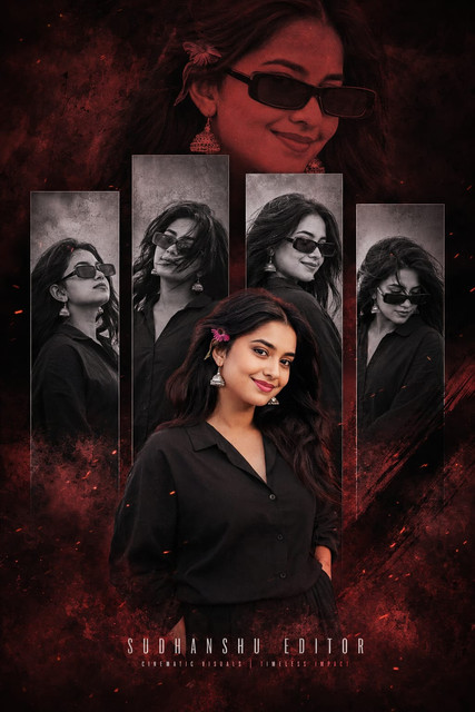
Secret Prompt
ULTRA-REALISTIC 8K CINEMATIC POSTER OF A STYLISH YOUNG INDIAN MAN. STYLE LUXURY CINEMATIC DIGITAL POSTER, DARK EDITORIAL AESTHETIC. BACKGROUND: DEEP CRIMSON RED AND BLACK TEXTURED WITH SMOKY ATMOSPHERE AND GLOWING PARTICLES. MIDDLE GROUND: FOUR VERTICAL RECTANGULAR PANELS FEATURING MONOCHROME B&W PORTRAITS. FOREGROUND: FULL-COLOR CUTOUT OF THE PERSON STANDING CONFIDENTLY IN A WHITE LINEN SHIRT. TYPOGRAPHY: LARGE BOLD 3D TEXT AT THE BOTTOM WITH [YOUR NAME].
To create dynamic background templates, you can use text-to-image AI tools to generate environmental lighting and texture bases.
Base Environment Prompt Template
Prompt:
A luxury cinematic dark studio backdrop featuring dramatic dual-tone neon lighting (cyan and ambient amber), subtle realistic smoke texture, low-angle depth of field, high-contrast shadows, hyper-realistic, 8k resolution, aspect ratio 9:16.
Design Tip: Keep the center of your background relatively clean and uncluttered so that your 3D text and main character cutout remain easily readable.
Step 2: Assembling the Composition (Step-by-Step Workflow)
Once your base background and typography assets are ready, assemble them in your photo editing application (such as Photoshop, Canva, or Snapseed/PicsArt):
1. Layer Setup & Positioning
- Layer 1 (Bottom): Place your generated studio background.
- Layer 2 (Middle): Insert your rendered 3D Name Typography. Position it in the center third of the canvas.
- Layer 3 (Top): Place your main subject portrait/cutout slightly overlapping the text layer to create an overlapping 3D depth effect.
2. Matching Light and Shadow Direction
- To make the cutout look integrated rather than simply pasted, add a blank layer above the subject and select a soft brush tool.
- Brush subtle highlights along the edges of the subject using the same color as your background neon lights (e.g., gold or cyan) to simulate rim lighting.
3. Adding Depth of Field & Blending Overlays
- Apply a slight Gaussian Blur ($2 – 4\text{px}$) to elements placed further in the background.
- Add light leak or particle texture overlays and set their layer blend mode to Screen or Lighten.
Step 3: Final Color Grading & Retouching
To tie all individual layers together seamlessly, apply these global adjustment parameters across the finished graphic:
- Contrast: $+10%$ to $+15%$ (increases visual separation between shadows and neon highlights).
- Highlights & Shadows: Reduce highlights slightly ($-5%$) to prevent text blowout, while deepening shadows ($+8%$).
- Details & Clarity: Increase overall clarity/sharpening by $+12%$ to accentuate fabric and text edge detail.
- Vignette: Apply a subtle dark border vignette ($+8%$) to draw the eye toward the center typography.
Troubleshooting Common Poster Design Mistakes
- Issue: The Text Is Hard to Read Against the Background
- Fix: Add a drop shadow behind your text layer or place a semi-transparent black gradient overlay between the background and text layers.
- Issue: The Cutout Looks Unnatural on the Background
- Fix: Match the color temperature. If your background is cool/blue, apply a slight blue color tint to your subject layer using color balance settings.
Summary
Crafting cinematic name artwork involves thoughtful layering, precise light matching, and clean typography placement. By mastering depth layering and color correction techniques, you can turn simple photo cutouts into polished digital posters.